Work180: Employer profiles
275% increase in organic traffic.
The Equity Board had a name. Nobody knew what it should look like.

Context
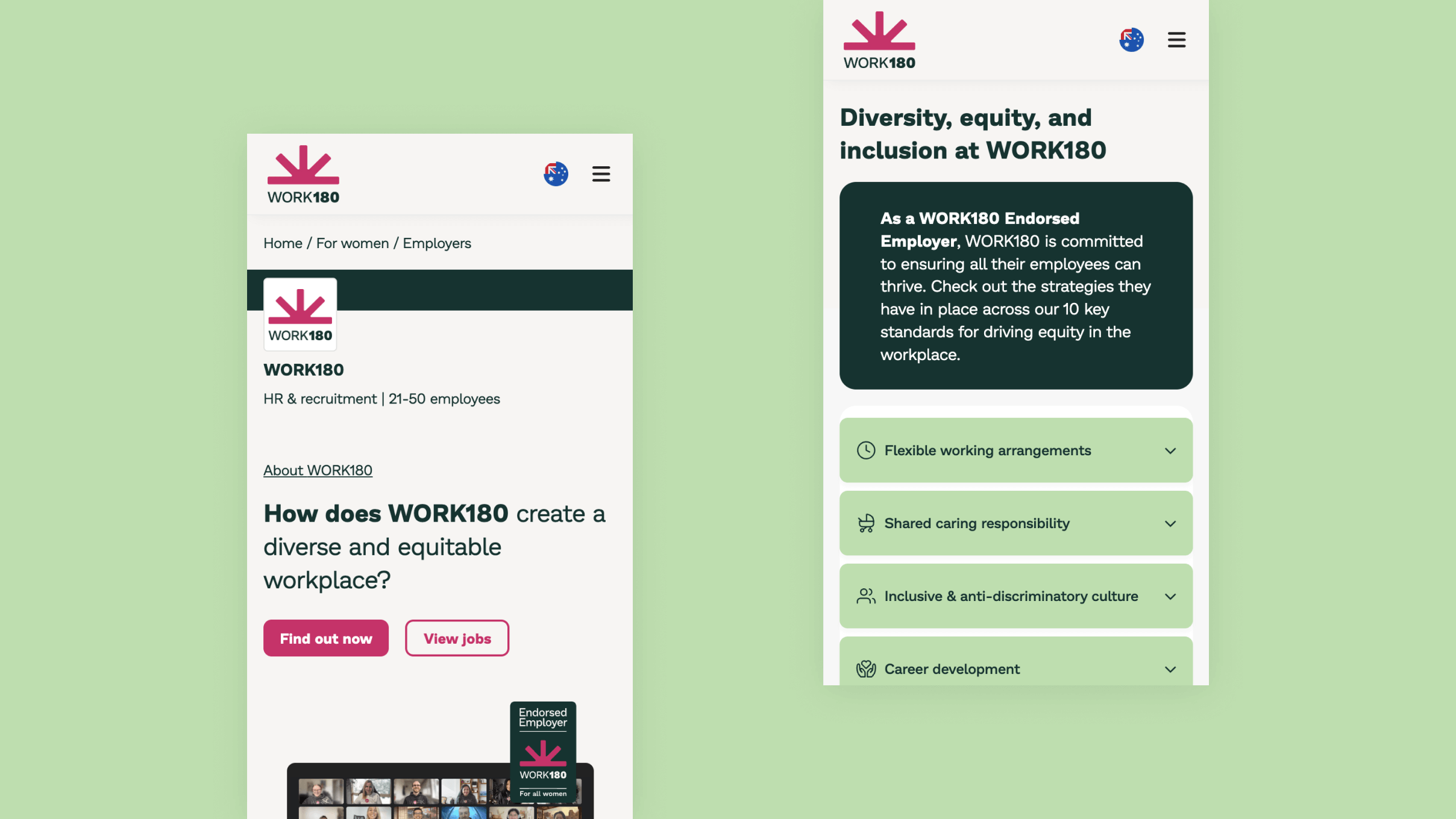
WORK180 helps women find workplaces that actually support them. Over 100 endorsed employers — Microsoft, BHP, Atlassian — had their policies on the platform. The existing template was burying the information that mattered most.
The profile redesign had a centrepiece: the Equity Board. What it was, what it looked like, how someone would actually use it: still open. No one had a clear picture. I joined as the team was trying to make it one.
Research
A workshop with the team first. Everyone drew their version of what the Equity Board could be. No existing visuals, no brief beyond the question. Those drawings became the starting point.
The first wireframes went to the whole company: a vision, not a proposal.
The wireframes were the first time anyone had seen it. It started the conversation.
Wireframes into a clickable prototype, then to real users. Two things came back above everything else: Flexible Working and Shared Caring Responsibility.
The profile template was redesigned around them.
The Build
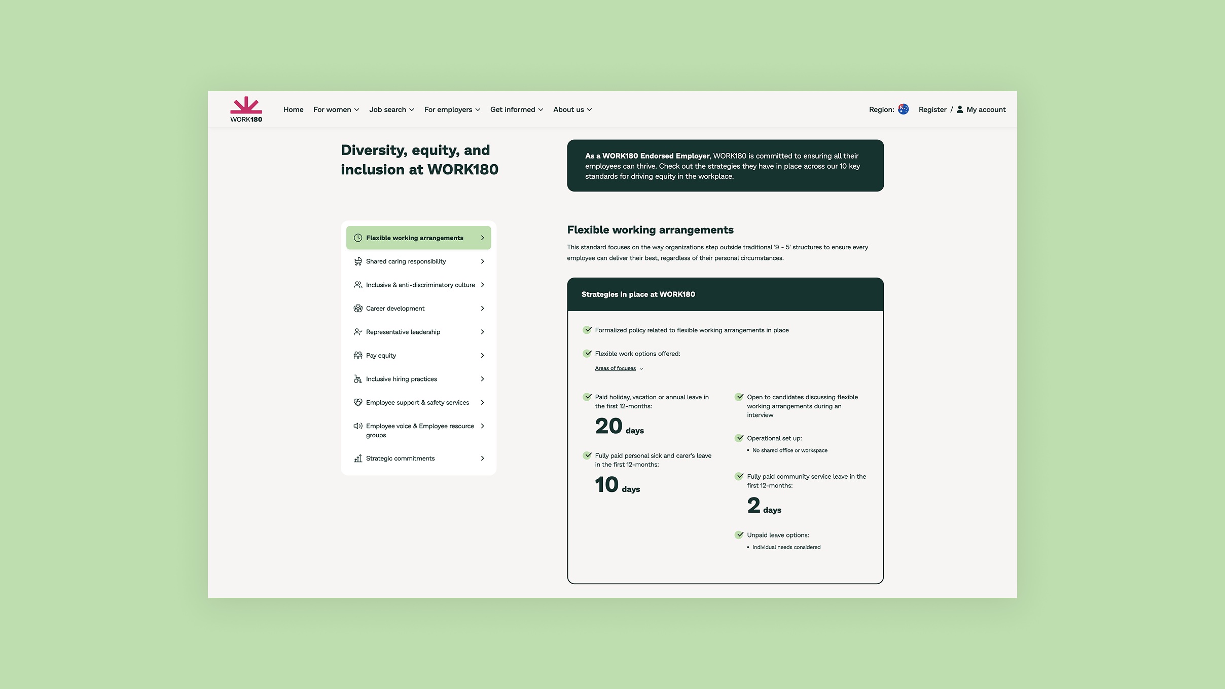
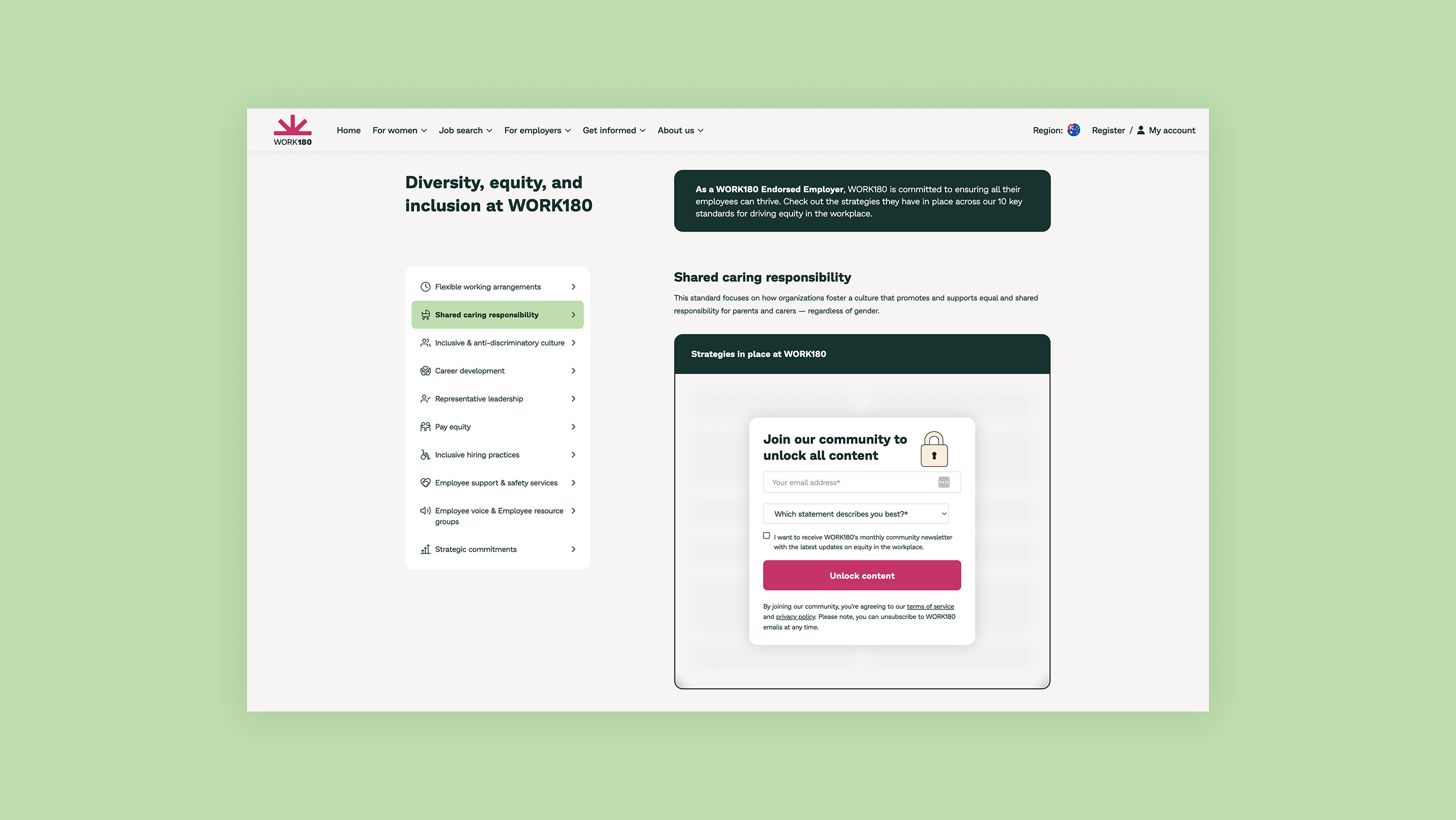
The Equity Board: 10 tabs, left-hand navigation, content on the right. Two flows: free and gated. Research decided which policies stayed open and which sat behind a signup.
Research decided which policies stayed open. Flexible working: always visible.
Outcome
A new profile template held across 100+ employers. Different content, different volume. One component system, consistent brand either way.
275% increase in organic traffic.