OzHarvest: Annual Report
Australia's largest food rescue organisation.
Same content, same brand, but every year the client wanted a different experience. What stayed consistent was the principle underneath.
Visit →Context
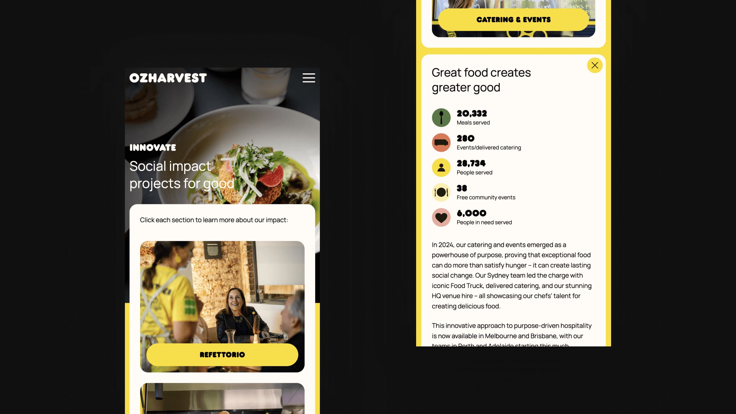
OzHarvest is Australia’s leading food rescue organisation. Every year they need their impact report to do more than list numbers.
I’ve designed and built this for three consecutive years (2023, 2024, 2025). Each year the client brings new references and feedback from the previous version. Same content, same branding, but a different experience every time.
Design Decisions
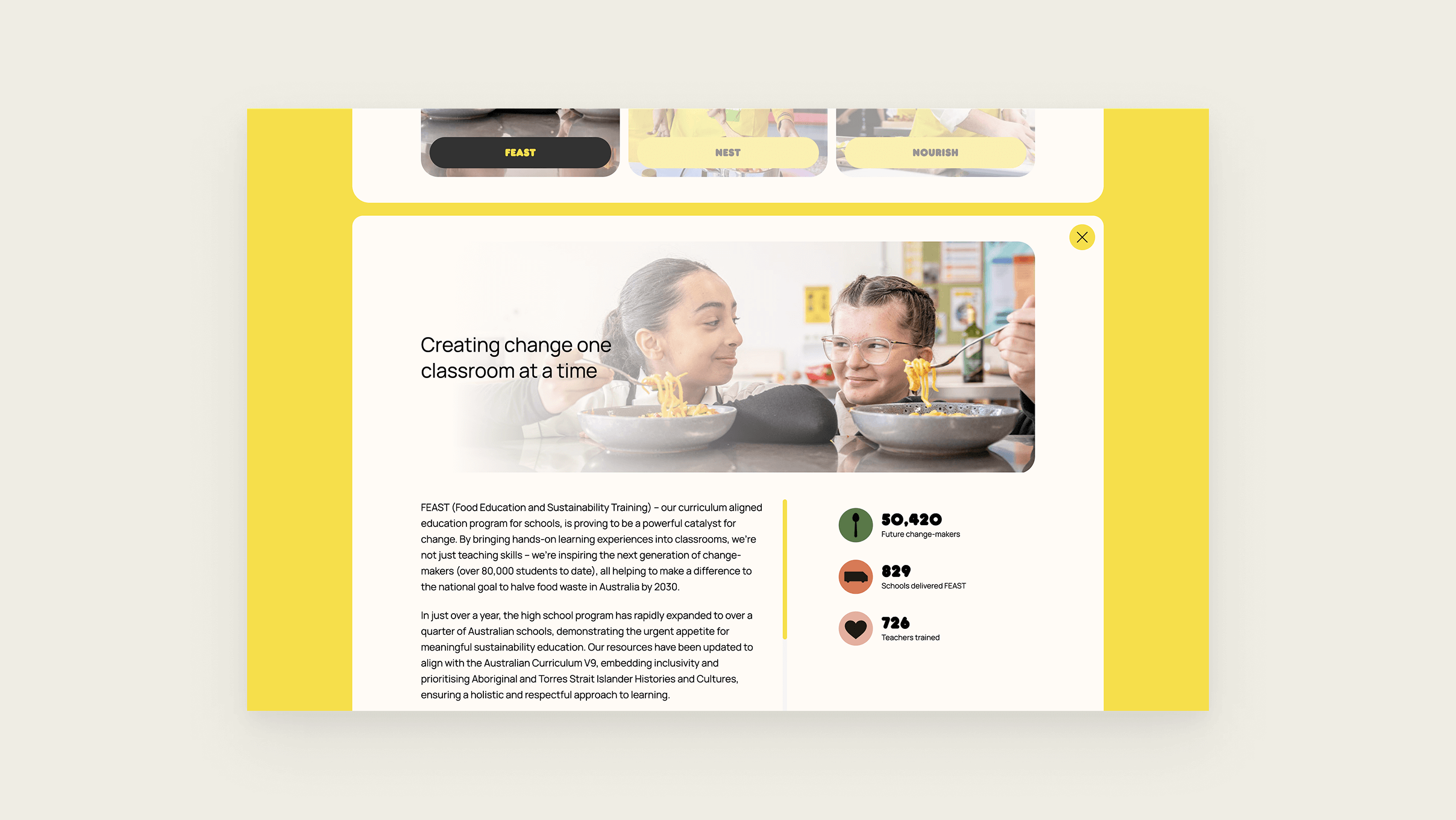
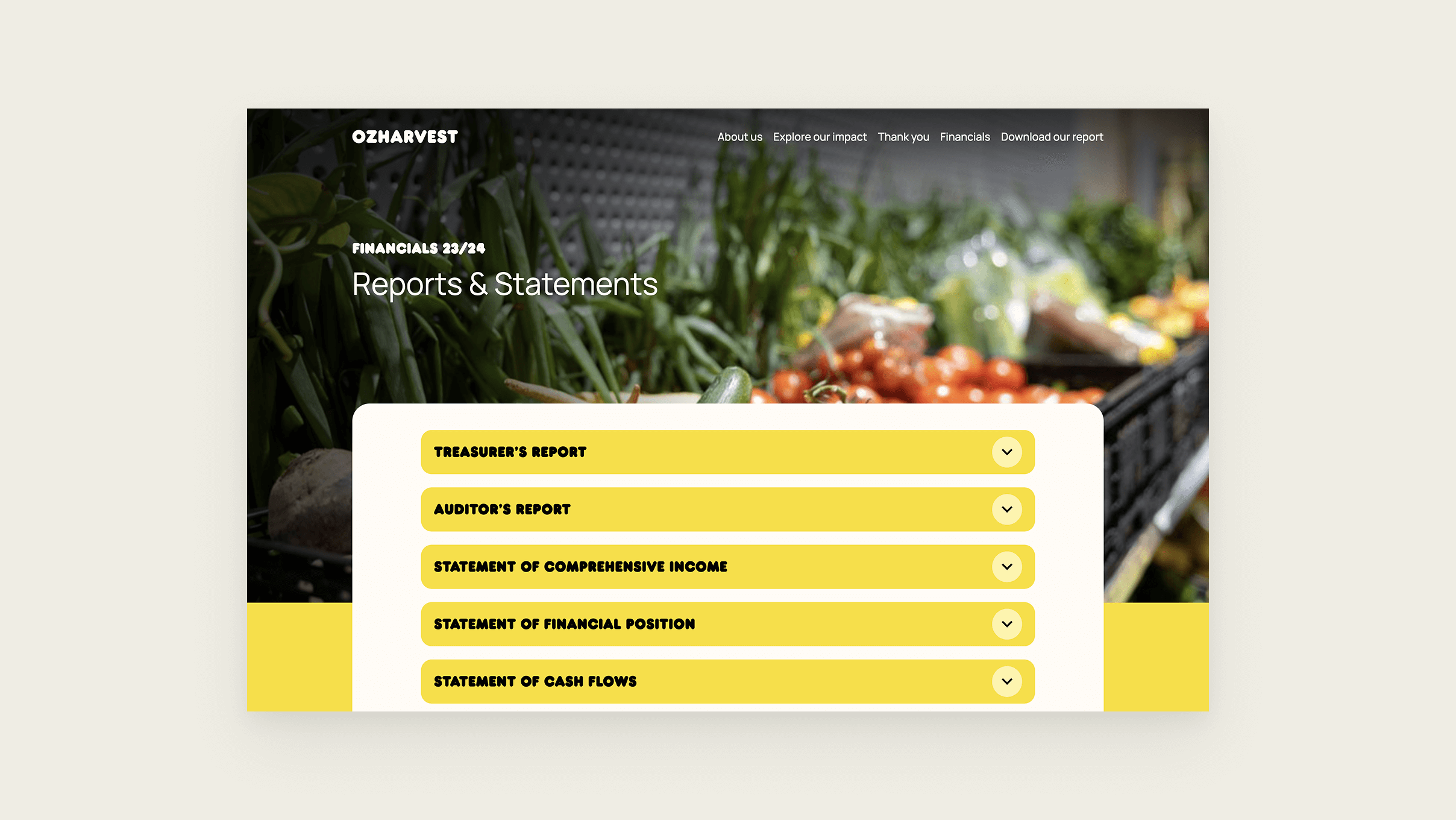
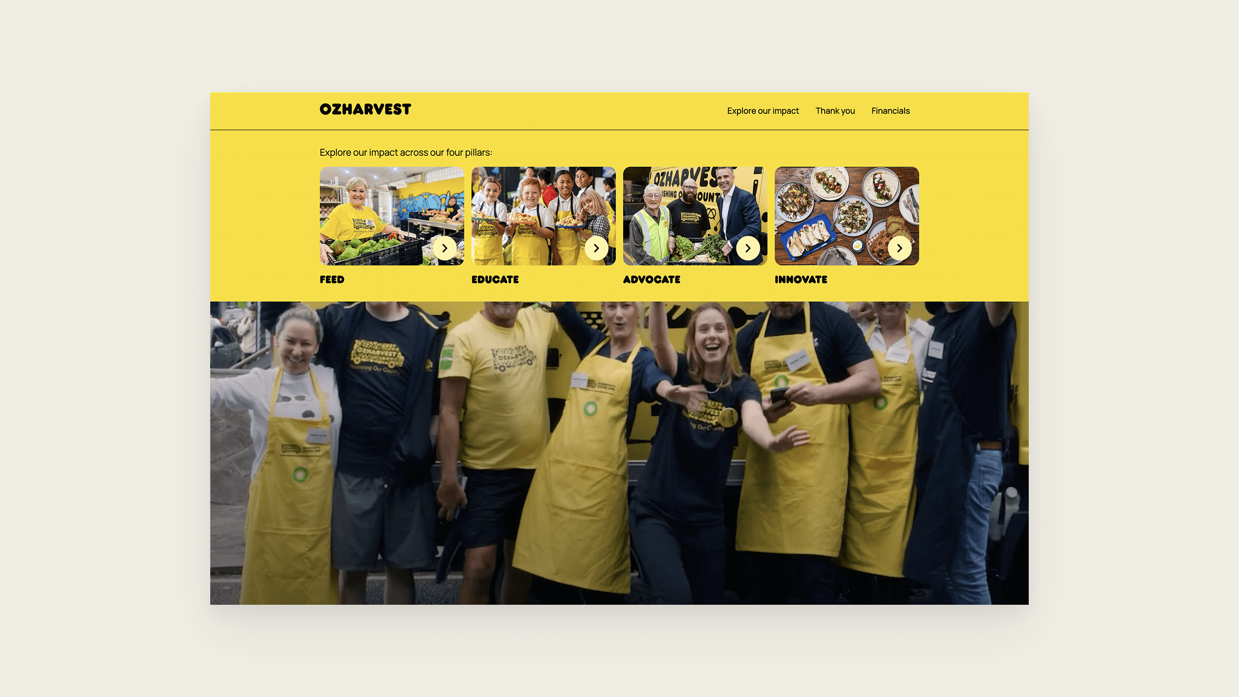
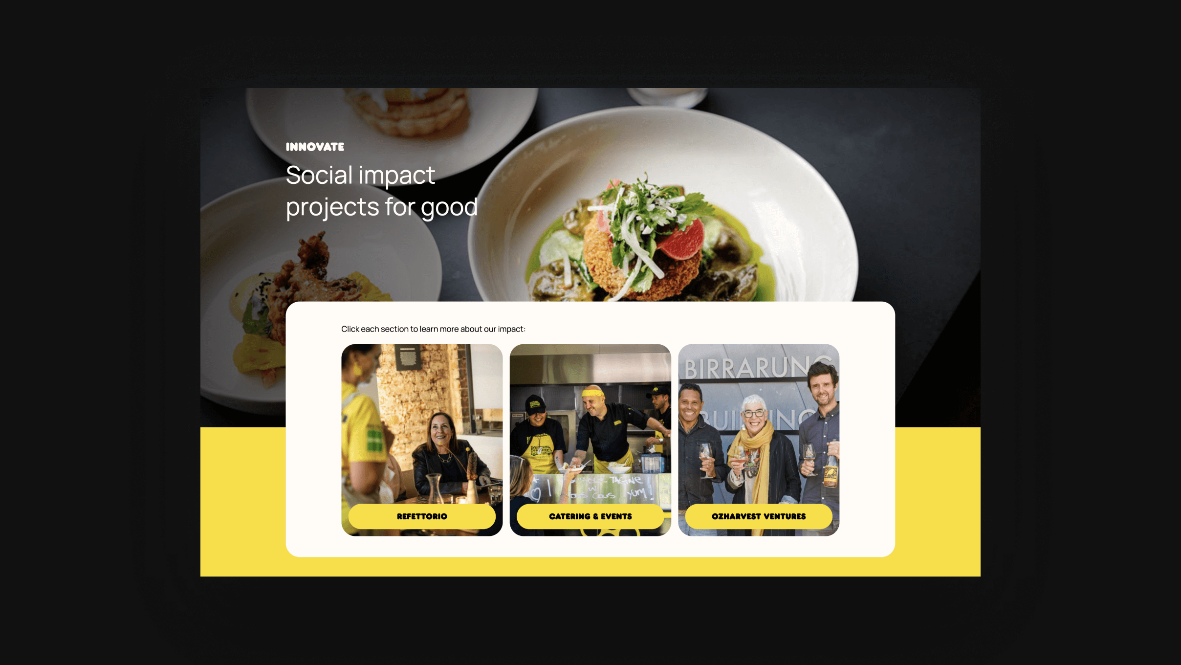
The layout changed every year. The underlying principle didn’t: users scan, not read.
The approach held every year: design for scanning, not reading. Everything else moved around that.
Redesigning, not iterating, worked because the principle was stable.
Each year was a different take on the same problem: how do you make data-heavy content feel light? The constraint was always the same, lots of content, limited attention, but the approach kept evolving based on what the previous year’s feedback told us and what the client was asking for when they shared new references.
CMS for client independence so they can manage updates themselves without needing me for every text change.
Outcome
Three years running. Each year started from scratch with new references and last year’s feedback.
The relationship compounds — understanding the client’s content, their audience, and how they communicate gets sharper every year.
That’s what makes redesigning viable instead of just starting over.