I ignored the clone-this-SaaS posts for a while. You know the ones: screenshots of revenue dashboards, threads about rebuilding tools with AI in a few hours, mostly clickbait.
Then I read a dev diary about rebuilding a Canny clone after the subscription jumped to $360 a month. What stayed with me wasn’t the build log. It was a single line near the end: “Some of those line items might be worth a weekend.” That one I believed. Not because it promised easy money, but because it came at the end of a detailed build log from someone who’d worked through the actual friction.
I’d already been in that mode. Building small tools to learn, not to scale. So I made aweekend to stress-test the question: which subscriptions are actually worth replacing? Your cost, your rate, your honest read on complexity, and a rough breakeven to start the conversation.
The first prototype came fast. One conversation with Claude, one file, working UI. It looked good. The logic ran. If I’d been optimising for speed, I could have shipped it that afternoon.
Then I started actually looking at it.
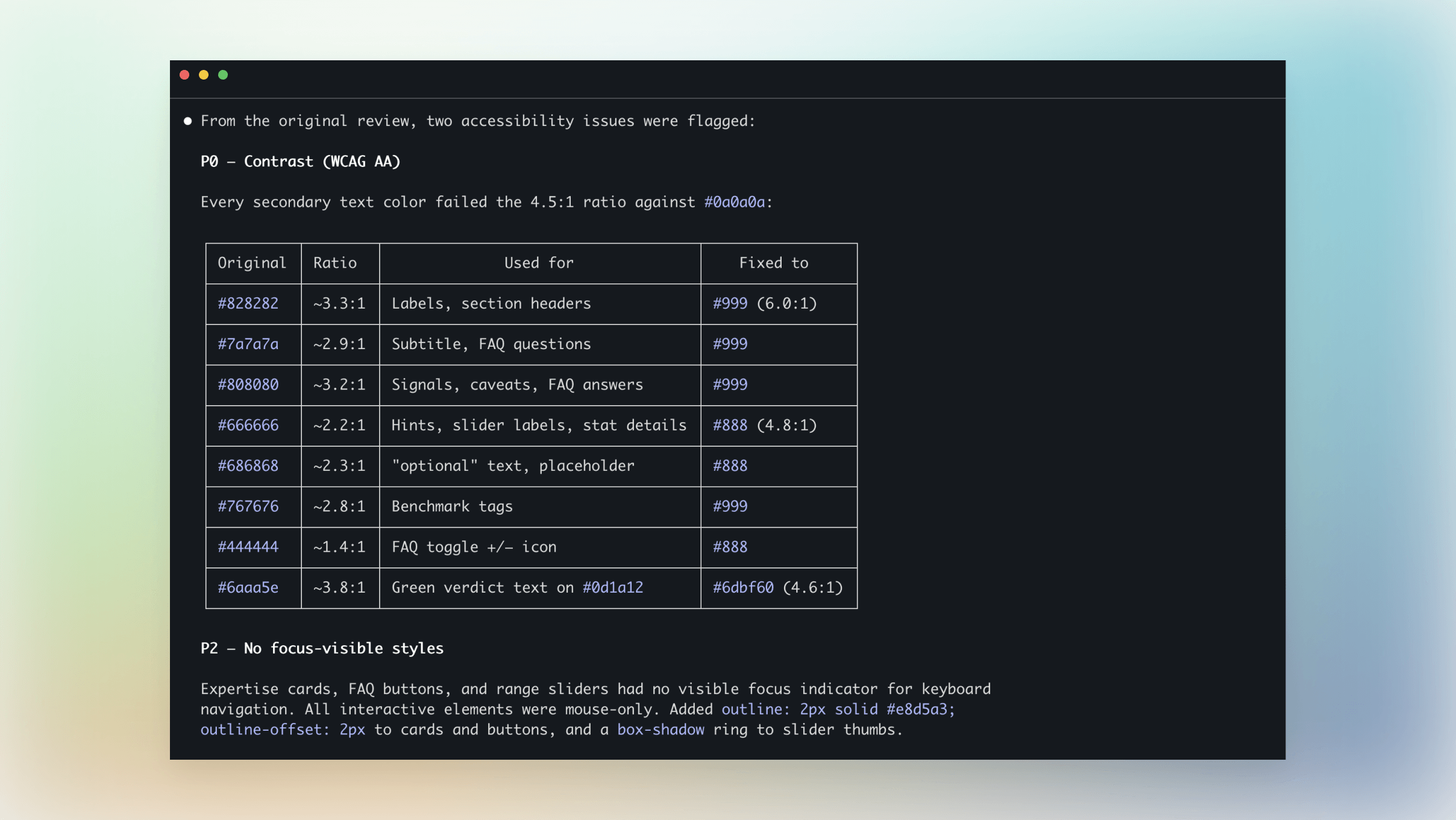
The typography had eight different font sizes with no consistent scale. Half the interface failed WCAG AA contrast ratios. 17 failures across labels, helper text, and verdict copy. The value proposition didn’t hold either. I was trying to give users an exact number, but the variables were too squishy: complexity, hourly rate, maintenance costs. The precision was false confidence dressed as a calculation.
That was the real design problem. Not the colours. Not the type scale. The tool was framed as a calculator when it should have been a conversation starter.
Execution got cheaper, but ownership didn’t.
So I pulled the prototype into my IDE and ran three review agents across it: one checking UX and visual design, one checking voice and copy consistency, one stress-testing the logic.
Between them they surfaced 11 issues across three priority tiers. The accessibility fixes alone took every secondary text colour from failing to passing without touching the palette.
The logic got the biggest rework. I was trying to give a definitive answer, but the tool worked better when it stopped pretending to know more than the user and started helping them think about whether it’s even worth a weekend.
Scattered across most people’s billing history are a few line items that might genuinely be worth a weekend.
That’s what aweekend is. A quick estimate to start the conversation, not end it.
The prompt got me a working prototype in an hour. Getting from there to something I’d put my name on took another 18 hours. Not because AI failed, but because the gap between “this runs” and “this is ready” is where the product decisions live. Type scale, contrast, information hierarchy, the framing of the output, what the tool promises and what it actually delivers.
AI collapsed the build cost. It didn’t collapse the thinking.
Working out which line items are worth a weekend is still harder than the code.